Monday, November 30, 2015

Visual Storytelling 1: Final Project

For the last 5 weeks of Vis1 we were working on our final projects for the class which was to make a minimum of a 3 page comic taken to full color. But being the over achiever I am, I wrote a 6 page script. In order to see this project to completion I decided to go with a very simple, graphic, cartoony style. I really enjoyed it but I would defiantly describe it as different from my usual style. although that's just me, maybe I'm over thinking it.

Same as my Advanced Inking final, I'll show the full final first then go through the steps to show process, changes, and decision making


Ok so first I wrote out a script and did some design sketches.


This is an early EARLY draft of what the sea monster would look like. hang tight there are several revisions to come before the final.


Here is the first pass at thumbnails. Really loose, just trying to figure out shots and compositions. It is almost hilarious to compare these to the finals.


Needless to say, this is not the monster that made it into the final. I wanted to go with a serpentine sea monster originally because I felt it would feel more eire and threatening than a more aquatic looking creature, but I was wrong, so I changed it for a more octopus based creature. Also I got rid of the insert panel, because I felt it took away from the moment and was unnecessary.


Next Draft


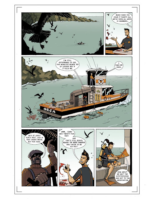
I went in and refined the drawing of the boat so that the perspective was accurate.


I recomposed panel 4 so that the pilot is now framed by the doorway while talking to Reece


I was encouraged to add fish swimming away from the monster in panel 6. because without the fish fleeing there is no reason for the diver to turn and see the shark coming at him.


I made the shark moment bigger.


Clearly the biggest change, now we have a sea monster! BUT It's still not menacing. It's just sitting there...

Better but still to recognizable as just an octopus.


Okay! now we're talking!


Inks.

I made my inks using primarily a pentel brush pen and technical pens.


I really enjoyed the ink work on this page. from the splatter on the middle panel to the solid black bars in the last panel. I am really proud of how well this comic works in just black and white, even though color does help in the end.


And again with the color to talk about the color choices.

 I wanted to start with a blue/orange color scheme that slowly slides into the green/red color scheme of the creature. Also, the story gets progressively darker.

The layout below is how it would be viewed in a printed comic with each level representing a page turn.


Enjoy your next adventure swimming in the ocean! watch out for those pesky Black Tips.


Wednesday, November 25, 2015

Advanced Inking: Final Project

For our final project we were charged to make a 3 page comic in black and white using the techniques we have learned so far in the quarter. In my Visual storytelling 1 class we had to do a 3 page comic as well but I did a 6 page comic so I made that one very graphic and simple in style, so I really wanted to go all out for my Inking final. In classic form however I went for the stars and did 4 pages.

But I have a good reason. My comic has an important reveal on the last page. Technically this story could take place in 3 pages, but I wanted my final reveal page to be a splash page and on a page turn so it had to be an even number of pages.

Anyway, you came here for art. Here is the final first because I don't want to spoil the story by showing process.

This whole comic was inked traditionally with brush and ink. a little frisket and a touch of white out, cause pobody's nerfect.


Fun right? Anyway, here are my thumbnails and decision making reasons.


Here's some early concept art.


This first page, as mentioned before, is mainly just filler. But that is a bad reason to have a page, so I used it to further the story also. My showing the lion as a killer, granted for food, on the first page it makes us sympathetic for the zebra on the following pages. As far as it being a night scene, I wanted the chance to play with frisket as an inking technique which was awesome. But also it shows a change of time from page 1 to page 2.


In panel 1 the Lion is the highest thing in frame. showing that he his king of the realm.
the rest is pretty self explanatory.

This was a fun sequence, I wanted to really sell the idea that there are three characters even though there are only two. After seeing the next page and reading the reveal this page is really very Zentaur heavy but for now it seems really balanced between the "three" characters.

Defiantly my favorite page. I changed the final from this thumbnail by having the Zentaur sling the lion over his shoulder instead of wearing it as a headdress. I did this for two reasons, first I wanted to show the Zentaur's ears and mane since we saw them earlier. Secondly I wanted the Zentaur to be the highest thing in frame similarly to panel 1 of page 2. Im a little concerned about the proportions of the final illustration, but it might just be the lion skin backpack I don't know. Im happy with the rendering. I would love to color this later when I have time but It probably wont happen because Id rather just move on.


Tuesday, November 24, 2015

Thumbnailing practice

For Visual Storytelling we had a couple assignments where we just thumbnailed a short comic. Here are some of the thumbnails I came up with.


I learned of the importance of spotting blacks. and how you can make a grey by stacking sets of black lines close together. I have not attached the script because I don't know if I can, and my storytelling should speak for itself. But I will say, the script was pretty ratchet.

Basically there is a couple checking out a creepy church, and in the meantime a lunatic in an asylum starts to freakout becasue of whats happening in the church.


So yea, I dont have much to say, I just hope it reads well, I might take this to final art some day just for my portfolio, we'll see.